This is a project that I worked on as part of the course |The photographer’s voice”, in Zilum Baam school of photography.
Just as I was…
This is a project that I worked on as part of the course |The photographer’s voice”, in Zilum Baam school of photography.
Just as I was…
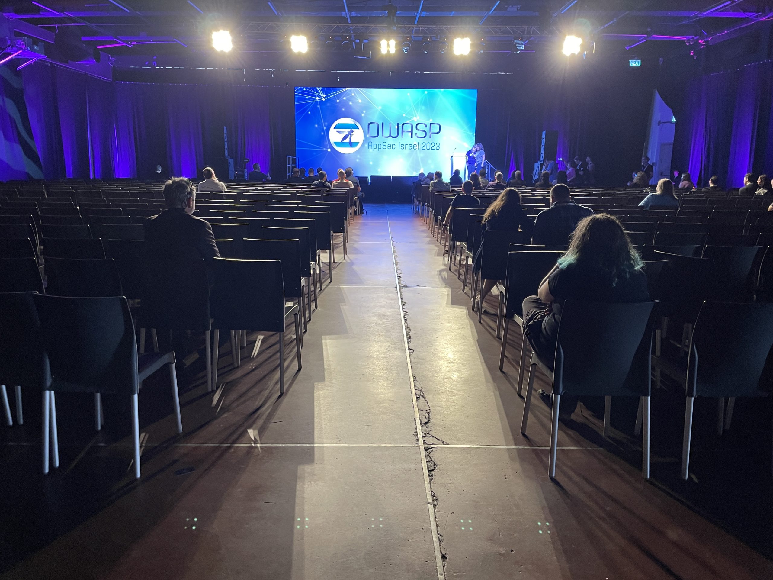
I attended OWASP’s AppSec Israel 2023 Conference. It took place in Tel Aviv Expo in May 2023.

https://appsecil.org/
Agenda: https://appsecil.org/Agenda
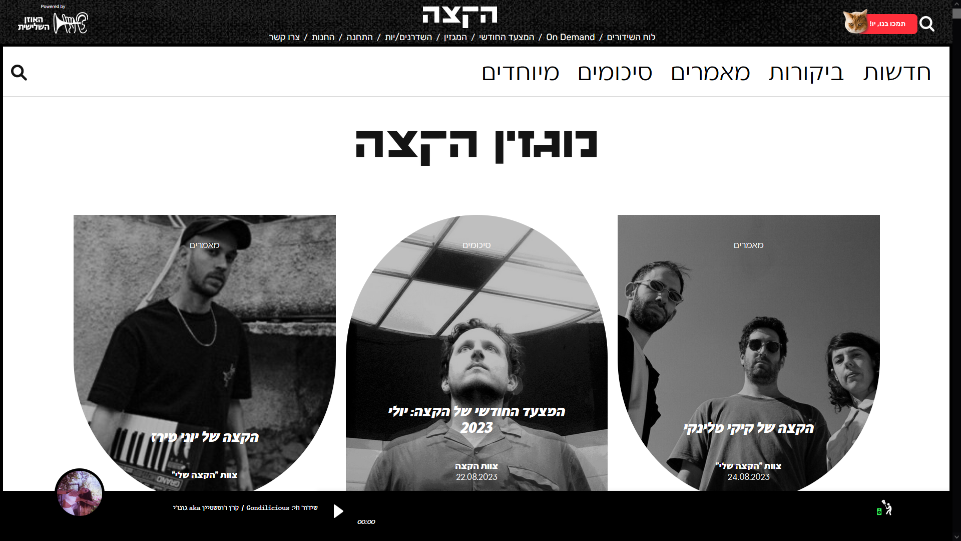
A few years after we launched the new website for the radio station, the team decided to take it one step further and to launched a magazine, and post articles on a regular basis.
Initial discussions led us to the understanding that this would be almost a whole new website. We want to use the same DB and that the same users will have access; But it will have its own pages and information architecture, and its own design.
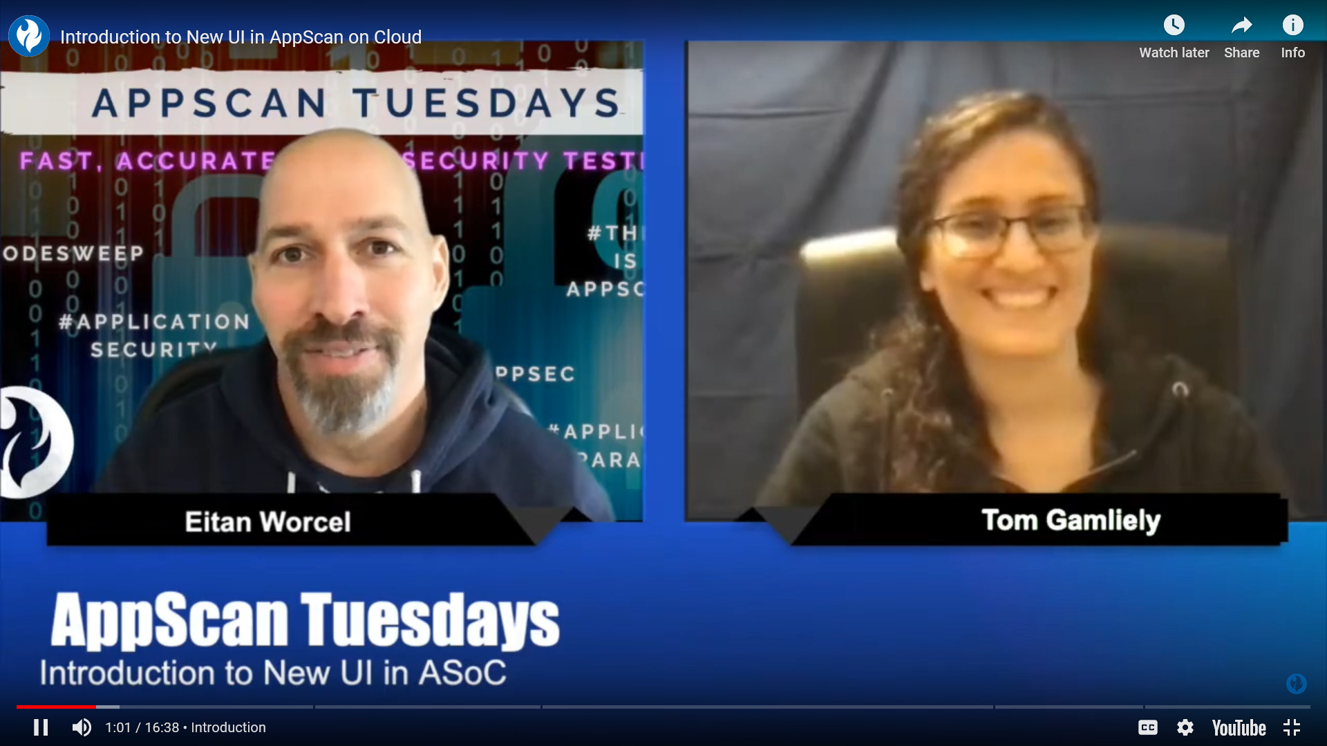
On March 2020 I was invited as a guest to the video blog “AppScan Tuesdays” and introduced the new UI that we designed for AppScan on Cloud.

A couple of months I visited Berlin. A short spring vacation. I checked the temperatures before my trip, it looked like a nice warm 20C. But by the time I got there, the temperatures dropped to 7C. Looked like winter was not ready to let go just yet. It was very cold, certainly more than I had expected and prepared for. I stopped feeling my nose. I couldn’t take my hands out of the gloves to take pictures. But I was fascinated by the colors. The skies were gray, and they brought out the colors of the city: The trees in transition from brown to bright green, the buses and trains in saturated yellow, and here and there a dash of orange or red to complete the set. I kept seeing these colors again and again, they stood out in many of the pictures that I took. So after I finished sorting the pictures, I created this palette.
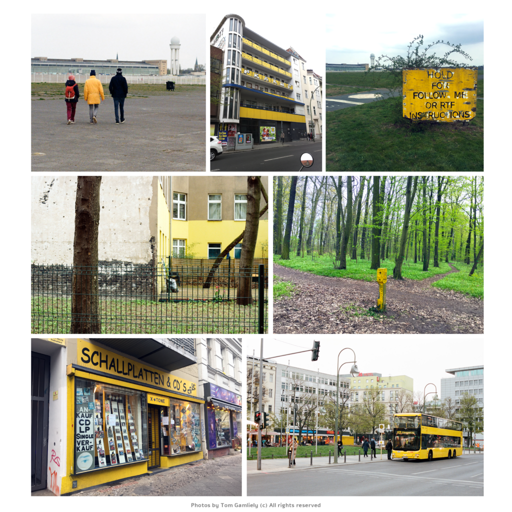
All the public transportation cars are yellow: The train, the buses, the light rail. Strong, saturated yellow, that stands out from afar. Signs and posts are also yellow. And occasionally I saw buildings with a soft yellow front.
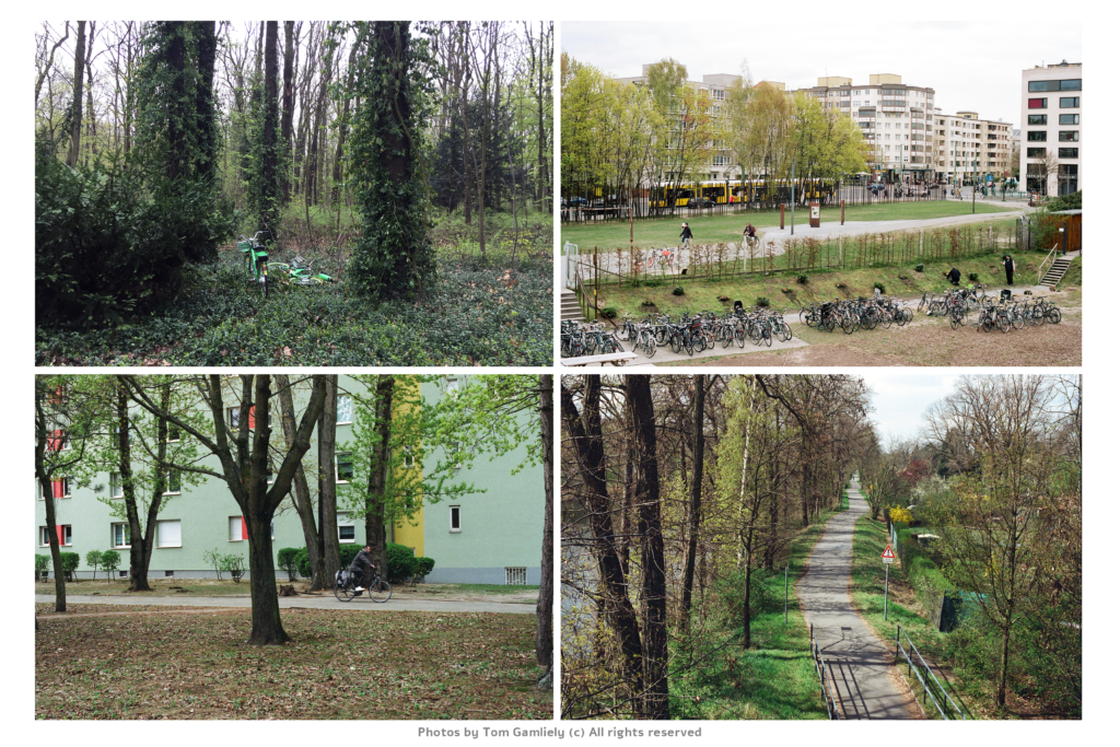
The city is full of parks, it’s fantastic. Most trees are very tall. There were at least two noticeable shades: the bottom leaves were dark green, while the top leaves were light green.
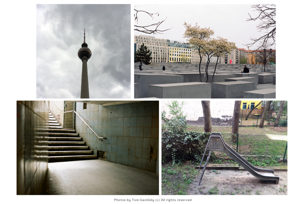
The dramatic skies were the perfect setting, and influenced every picture. But there were also structures, monuments, that wore the same cool gray.
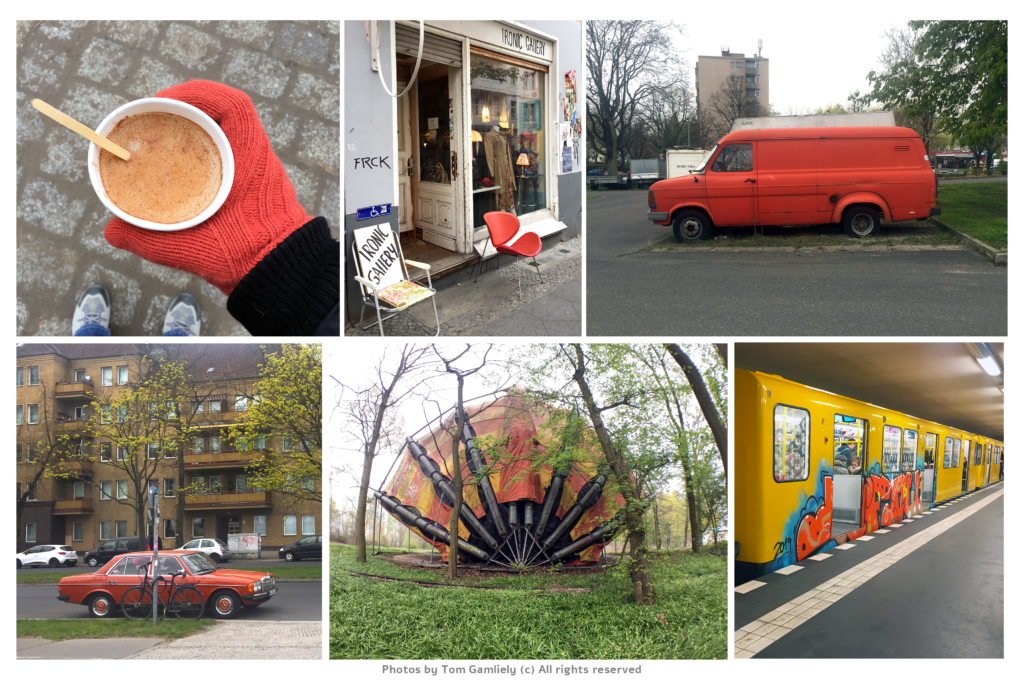
Orange seemed to fit very well with the green and the yellow. A car, a chair, some graffiti, it took the palette an extra step. Even the gloves that I bought there were orange.
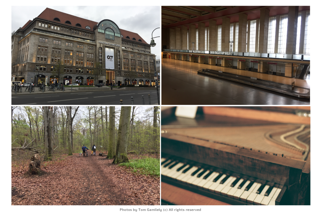
Another dramatic shade that was noticeable was dark brown. Buildings, mostly, inside and outside, but it was also seen at the parks.
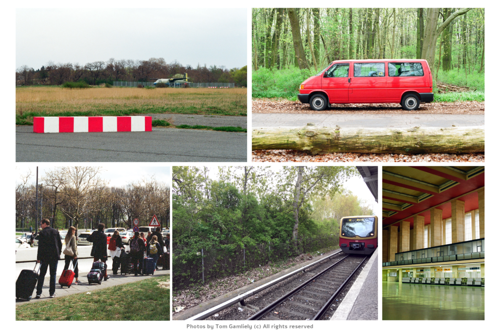
Red wasn’t as prominent as the other colors, but whenever I saw it, and it was always such a great touch.
Funny story, I was so cold, I must have searched for gloves at half a dozen stores at least. Whenever I walked in, and asked for gloves, the salesperson would shrug and say: We don’t sell gloves anymore, it’s summer! 😀
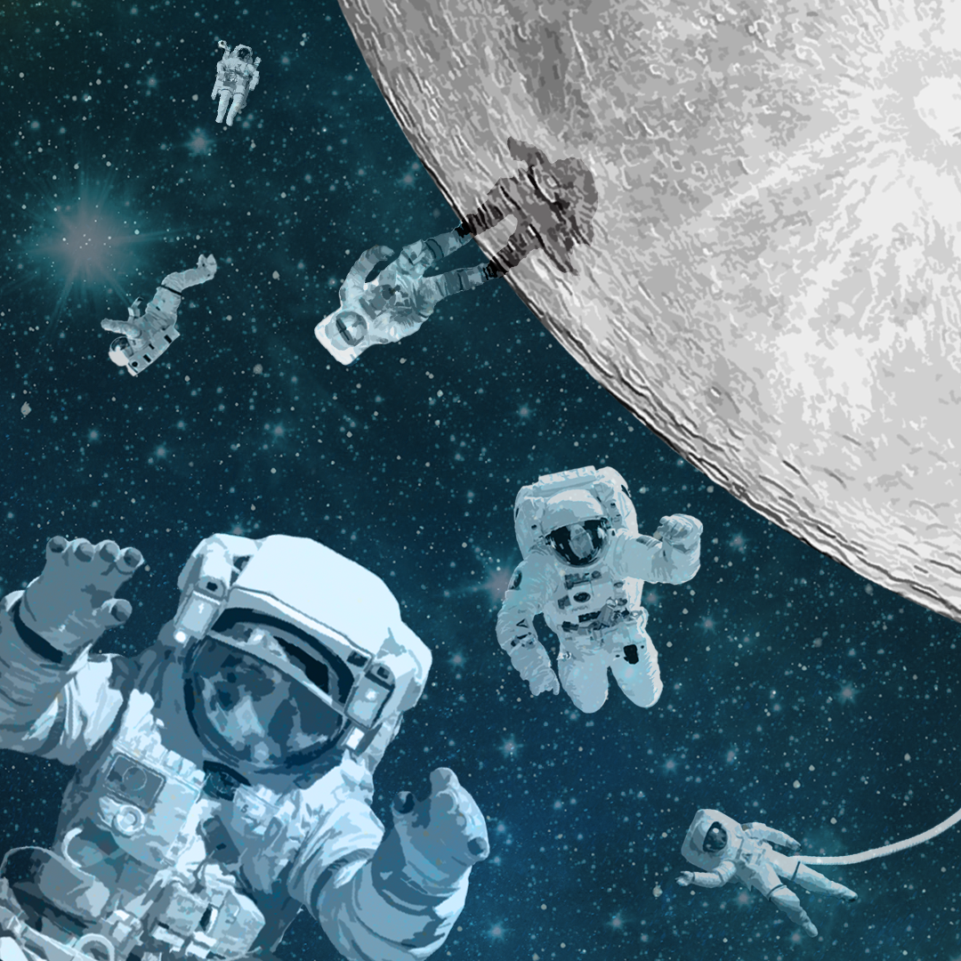
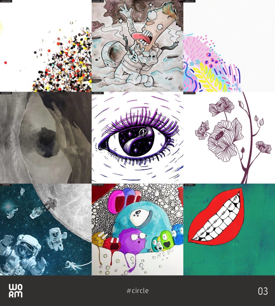
TWP is a collaborative project that brings together artists from different mediums to create a single work of art.
Here are the rules of the game: The moderator creates a canvas with a basic shape or theme, and then divides it into 9 equal tiles. Each participant gets a single tile, and has to draw or design something creative in that space, in whichever style they like, while keeping with the lines of the piece of the shape that they got. None of the participants know what the others choose to do. After all have submitted their design, the moderator puts all the tiles back together to a single canvas.
Being a space-exploration fan, I decided to go with the moon as a theme. To get the feel that I wanted, I used free images from #NASA flickr and image archive.
Here’s what I have submitted:

—
Artists, designers, illustrators, photographers – they are looking for you! Send them a msg and join the next worm project!
Instagram: @wormproject
Facebook: facebook.com/wormproj